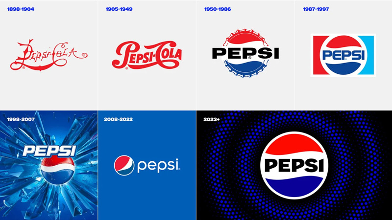
Mumbai: As the revered global brand Pepsi steps into its 125th year beginning this fall, it has enthused conversation with a logo and visual identity overhaul. This would be the first update of the iconic Pepsi globe logo in 14 years.
Ad professionals, in a tete-a-tete with Indiantelevision.com discuss what they think of the evolution of the Pepsi brand over the years, their views on the new logo and more.
For starters, the new Pepsi logo and visual identity will debut this fall in North America, followed by a global rollout in 2024, marking the brand's next era with an eye toward the future.
“The new design evolves the Pepsi brand to represent its most unapologetic and enjoyable qualities, and will span across all physical and digital touchpoints, including packaging, fountain and cooler equipment, fleet, fashion and dining. The new logo and visual identity pays homage to the brand's rich heritage while taking a big leap toward the future,” a press declaration mentioned.
The press statement further mentioned that the logo and visual identity thoughtfully borrows equity from its 125-year history and incorporates modern elements to create a look that is unapologetically current and undeniably Pepsi. The key design elements include:
- The Pepsi globe and wordmark unite to fit into a variety of settings and emphasize the distinctive Pepsi branding.
- An updated colour palette introduces electric blue and black to bring contrast, vibrancy, and a contemporary edge to the classic Pepsi colour scheme. Given the brand's continued focus on Pepsi Zero Sugar, the design brings in the colour black, further showing the brand's commitment to Pepsi Zero Sugar in the future.
- A new visually distinct can silhouette, which heroes the iconic Pepsi can as an accessible brand for all.
- A modern, custom typeface reflects the brand's confidence and unapologetic mindset.
- The signature Pepsi pulse evokes the "ripple, pop and fizz" of Pepsi-Cola with movement. It also brings the rhythm and energy of music, an important and continuing part of the Pepsi legacy.

The evolution of brand Pepsi over the years – an opinion
The brand has had a logo switch six times, making this the seventh. And experts can’t help but draw a similarity between the logo that Pepsi had in the 1990’s and the new one.

PepsiCo Foods former marketing director & CherryPeachPlum founder Vani Gupta Dandia elucidates, “Mostly brand custodians are simply restless and so they tinker and play with logos or visual identity. There's always a good strategy that can be retrofitted. I am not trivialising the many logo refreshes or the many rebranding exercises but more often than not the consumer remains nonchalant or fails to even notice what we marketers believe is a strategic masterstroke.
Pepsi is a low involvement brand and the only marketing activity that would have significant business growth impact is - visibility, clutter-breaking branding, and availability.”
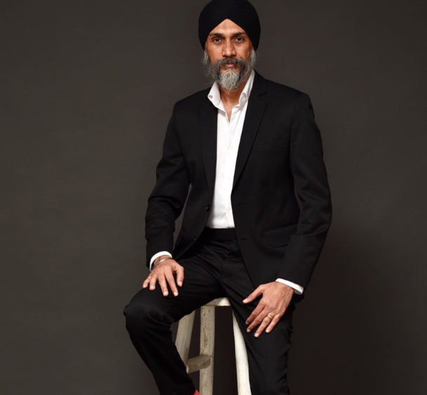
Thinkstr founder & CCO Satbir Singh goes down memory lane. “For a brand that has been around for 125 years, Pepsi has changed their logo about six times. The new avatar is close to the one that probably has the most recall.”

82.5 Communications chief creative officer MayurVarma understands that Pepsi like MTV exists only to be a youth icon. “And it’s obviously not easy to be 125 years young. No wonder Pepsi has struggled to keep up with newer brands across categories in defining youth culture. While Bollywood and Badshah approach did it for them till some time back, I get a feeling that they are falling a bit short now.”

Elara Capital senior vice president Karan Taurani believes that over the years, the brand has evolved in a very big way. “Every 10-12 years, they do have a logo change, that’s what we’ve been seeing. So, this hasn’t come as a surprise or as if it has never happened. The brand’s target audience keeps on changing – millennials, Gen Z – basically, everything put together. So you have to change what you stand for. This kind of a logo appeals heavily to Gen Z – the way it is designed. It shows a very vibrant sign, in terms of where they stand.”

The cola war: Will Pepsi have an advantage?
The never–ending cola war is just getting deeper with each passing day. Will this ‘new logo’ move by Pepsi prove to work in its favour?
Dandia deciphers,“The cola wars have intensified not just with Campa Cola coming into the market but also with the cola category desperate to reclaim its old glory in the context of so many other new beverages that consumers are now choosing and have access to.
What matters in this category is just visibility and availability - and this new logo with its bold confident typeface is likely to stick out more on the shelves as compared to the somewhat shy stylised logo that they had just before this.”
She goes on, “In the hot summer heat when one is really thirsty, one reaches out for the first familiar visible brand. This is where an eye-popping and shelf-popping logo or pack has far better chances of being picked. In fact, some science in this category says that the consumer makes the decision on which brand to buy in under five seconds.”
Taurani reiterates that the brand already has a recall. “What the logo will do is, it will stand out not just to the consumers of Pepsi but also attract incremental customers who are coming to the age group of the ones actually drinking and consuming these drinks.”
He further adds, “A lot of new things will come out from this logo – new campaigning, new merchandise, new celebrity tie-ups – so all these things are going to augur well. This is more like a new product launch and not just a logo launch for Pepsi. They already have five to six variants across product categories, and there is no possibility of launching a new product every three or five years, as compared to other companies or verticals wherein there are new launches every two or three years. So this is a moment wherein it’s more like a new launch for them, and the timing is correct because the market has just opened up away from covid entirely. Two or three years back they saw stress in terms of the demand and consumption of these kinds of drinks as everyone was afraid of covid, immunity etc. With the market returning to normalcy, people are going out in large numbers be it at restaurants, pubs, or cafes - I think this is going to work well for brand Pepsi.
This is the first summer that everything has opened up without restrictions. Last year also, by April-May things had opened up in terms of summer, but that was just after covid. So people were just coming out of it. I think currently the time is even better as compared to last year – maybe the market environment might be tough, but they can get an advantage by getting some good deals in terms of their pricing, advertising budgets because the market seems to be very uncertain because of companies cutting ad spends, there is a negative back in terms of overall ad spends. It’s a good indication wherein the market environment in terms of the covid fear standpoint is not there, things are very normal. And from the advertiser’s standpoint the bargaining power is better for the advertisers. It’s perfect timing. With IPL too, they would be able to generate a lot of eyeballs on this logo and the Pepsi brand recall, specifically. And once such initiatives are done by a company, the impact stays on for at least 12-18 months. So, I think there would be some sort of fillip in terms of whatever growth rates they would be getting. Historically, it could move up higher in the industry, I suspect, at least by 12-18 months because of the impact this is going to have.”
Varma comprehends that an identity change creates a chance to be re-evaluated instantly. “It shows you have a refreshing point of view. Or that you feel the times are so different that you are excited to change with it. I feel this change from Pepsi is more to discover itself in the new times rather than influenced by age-old cola wars.”
“As a choice of the new generation, Pepsi changes have always reflected cultural mindspace. It seems going no-sugar (in keeping with Gen Z trends) will be a big part of their strategy and mission. Which is why, they have borrowed from Zero Sugar and introduced the word mark in black,” tells Singh.
The new Pepsi logo: good or not so good?
Varma likes Pepsi’s new logo. “Especially when I compare it to the one they had before this. I feel they have gone back closer to their most successful identity of theirs. That coupled with the idea of using the logo as the ‘pulse’ makes it interesting in dynamic use cases. It remains to be seen what more they do with it. But I’d be excited if I was Mauro Porcini for the possibilities the new identity provides. It’s bold and simple enough to adapt with ease - both qualities which a youth icon ought to have.”
Dandia expresses, “The new logo of Pepsi looks more bold and confident and modern to me as compared to the logo that you had so far. It also harks back to the 1995 era when Pepsi first came to India with the Aishwarya Rai Sanju commercial. In fact, the new logo looks like it’s a small variation of what they had in the early 1990s.”
Taurani, too, gives a thumbs-up to the new logo. “It’s very vibrant, compelling and it really stands out. There is proper clarity in terms of the words mentioned, and the colour combination. It looks more global and imported as a logo. That is going to augur well for Indians because if you see generally, the Indian consumption pattern is clearly changing. Indian customers are not very loyal to one single brand – loyalty is coming down. That’s why you see that a lot of D2C brands have done well across categories – be it FMCG, or personal care, all put together. With this kind of a change what’s going to happen is that you could see a consumer of Coca-Cola move to Pepsi because of the entire look and feel of it. Not just the product taste and quality, but the look and feel also go a long way. So that’s why the change in the look and feel of the Pepsi brand has definitely been for the good.”
Singh concludes, befittingly, “Any logo change causes a flutter and jolts users out of their comfort zone. The brand owners in this case clearly don’t mind that and are convinced that Yehi Hai Right Choice, baby!”


